Hero image
The contrast on this caption is a little low.
Built with Astro, Tailwind, and React, documented in Google's DESIGN.md format, and adapted to light and dark mode.
Named by role, each with a dark-mode value. Blue marks focus, selection, and the one primary button.
Text
Primary text
--color-ink
Secondary text
--color-muted
Labels · disabled
--color-subtle
Surfaces
Page background
--color-page
Cards · menus
--color-canvas
Panels
--color-surface
Floating bars
--color-glass
Controls
Control fill
--color-fill
Hover · pressed
--color-hover
Hover in menus
--color-hover-subtle
Lines
Dividers
--color-line
Outlines
--color-border
Strong outlines
--color-border-strong
Hairline (0.5px)
--color-hairline
Accent and errors
Focus · selection · primary button
--color-accent
Text on accent
--color-on-accent
Selected fill
--color-accent-soft
Errors
--color-danger
Error background
--color-danger-soft
Media
Overlay backdrop (page colour, 88%)
--color-overlay
Behind embedded video
--color-media-backdrop
One typeface, TeX Gyre Heros, in ten type tokens. Components set type with these, never with loose sizes.
Display
--type-display · Bold · 2.5–3.625rem · the largest headline
Intro
--type-intro · Bold · 1.75–2.5rem · intro line, Brand project titles
Heading
--type-heading · Bold · 1.625–2.375rem · page titles and statements
Subheading
--type-subheading · Bold · 1–1.25rem · section and project titles
Quote
--type-quote · Regular · 1–1.25rem / 1.35 · pull quotes
Body
--type-body · Regular · 14px / 1.65 · body, metadata, nav
Label
--type-label · Medium · 14px / 1.65 · labels above values, the current nav link
Compact
--type-compact · Regular · 14px / 1.35 · controls, captions, dense lists
Tag
--type-tag · Regular · 14px / 1 · tags
Count
--type-count · Medium · 12px / 1 · numbers beside a label
Spacing
Padding, margins, and gaps use this 4px scale, matching Tailwind's spacing classes.
Page widths
Breakpoints
Case study
Desktop
Mobile
Comment mode
Desktop
Mobile
Mostly flat: depth comes from tone, hairline borders, and two shadow levels.
Borders
Hairline
0.5px · nav bar, comment cards
Line
1px · dividers
Border
1px · inputs, cards
Border strong
1px · higher contrast
Shadows
Raised
Cards that lift slightly
Floating
Menus and popovers
One corner radius for everything; a shell adds its padding to it. The pill is only for segmented toggles.
None
0 · full-bleed frames
Corner
0.5rem · everything
Menu
12.5px · menus
Panel
16.5px · nav bar, footer
Pill
Segmented toggles only
Switch to Inspect and hover a component to see the tokens it's built from.
For compact actions where the icon speaks for itself. Dismiss closes, primary is the main action, destructive deletes.
Standard
Default
Hover
Active
Focus
Selected
Dismiss
Default
Hover
Active
Focus
Primary
Default
Hover
Active
Focus
Disabled
Destructive
Default
Hover
Active
Focus
For picking one option from a short list, like a comment's category or the color mode.
Default
Hover
Active
Focus
Disabled
Open
Switches between two views of the same thing, like light and dark. Use glass over media.
Default
First selected
Hover
Second selected
Focus
Glass, over media
A value that can't be changed, like a comment's category. Count shows a number beside a label.
Tag
AccessibilityCount
6For moving between pages. Selected marks the current page.
Opens an image larger, growing from its spot on the page over a see-through backdrop. Arrows and slide dots sit below the image.
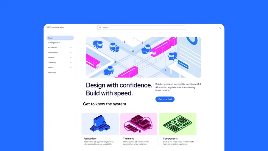
A caption describing the work, in secondary text.
A comment's category, the element it's about, and the text. Your own comments can be recategorised, edited, and deleted; everyone else's are read-only.
Your comment
Default
Hover
Text hover
Active
Editing
Error
Read-only
Default
Hover
Active
Admin review
Quick and physical: things press in and slide.