A design studio shouldn't outgrow its identity.
- Design Intern
- Stakeholder/PM
- 3.5 weeks
- Brand Design, Web Design
Intro
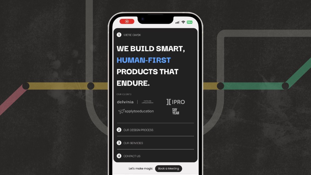
I collaborated with another intern to reimagine GWSK’s brand identity and website. We built a transit-inspired system that brought personality and consistency back to the studio.
The result was a full brand system, reusable templates, and a redesigned site: gwsk.studio .
Visuals
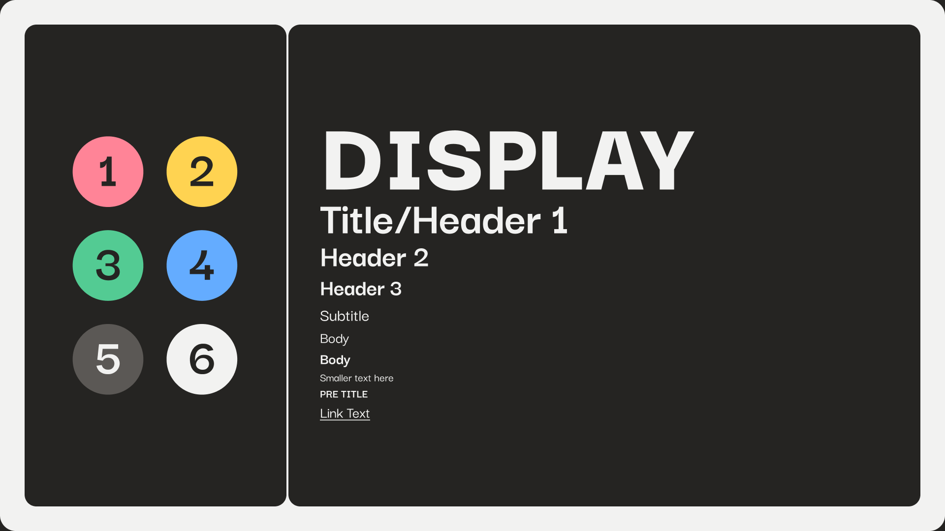
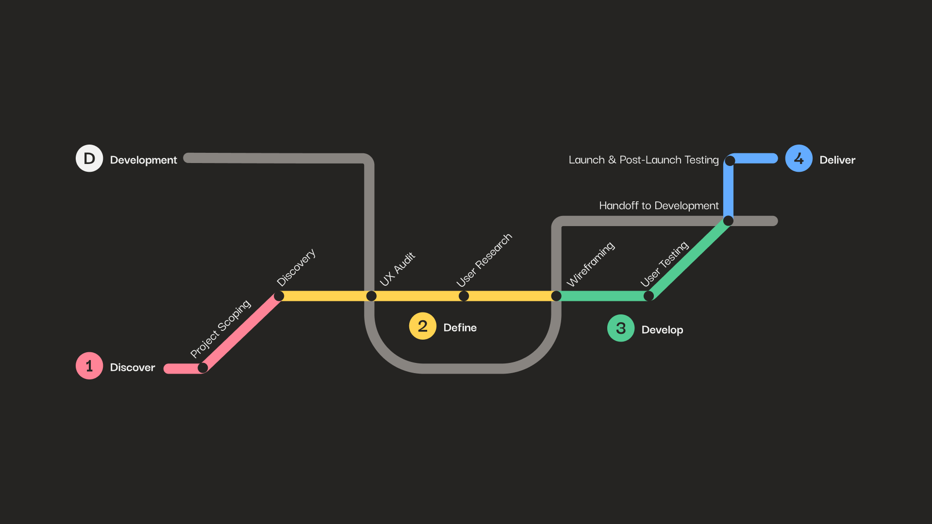
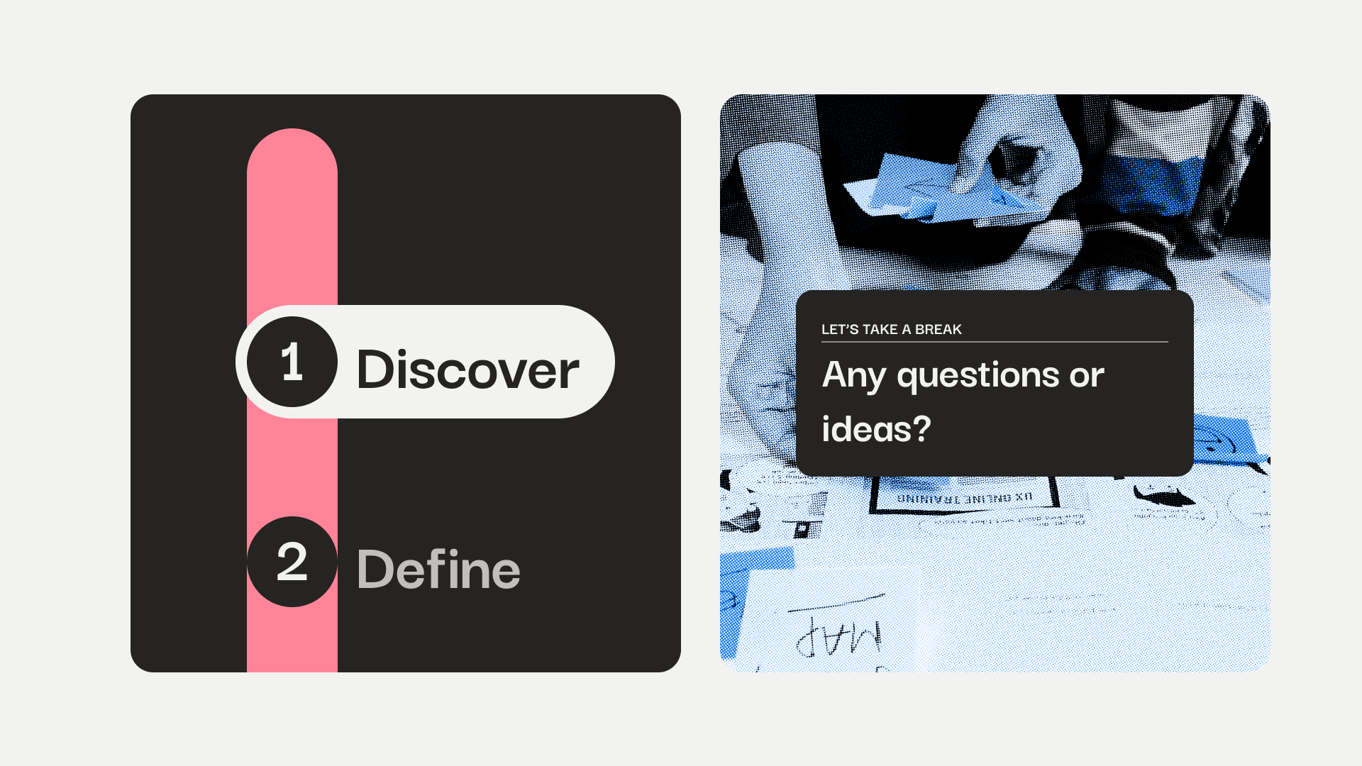
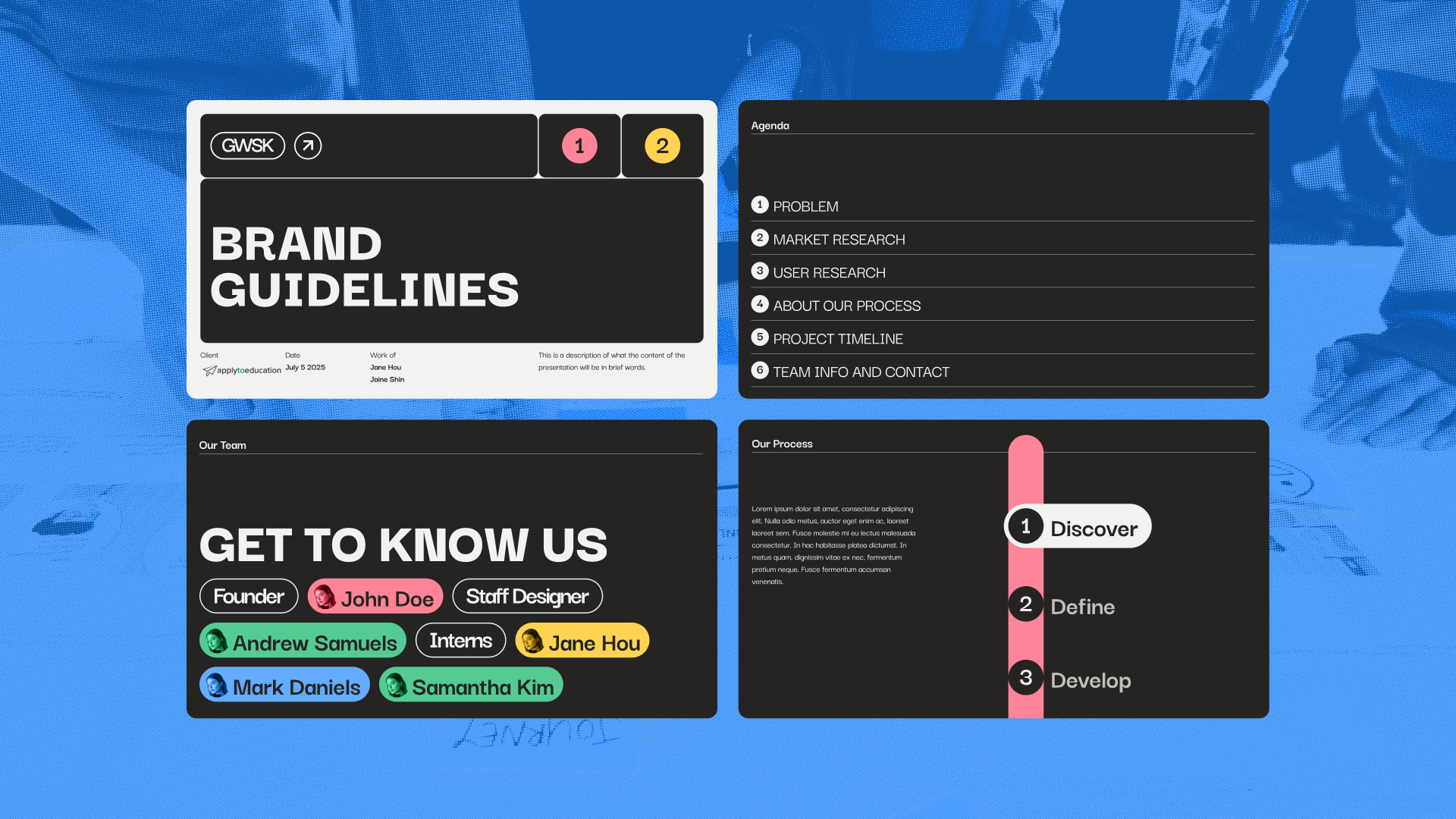
Brutalist, smart, and accessible. Accent colours map to Double Diamond stages so the brand stays modular without feeling robotic.
Final website
Interactive site walks through who GWSK is, how they work, and how to book, tuned for both desktop and mobile.
Exploration
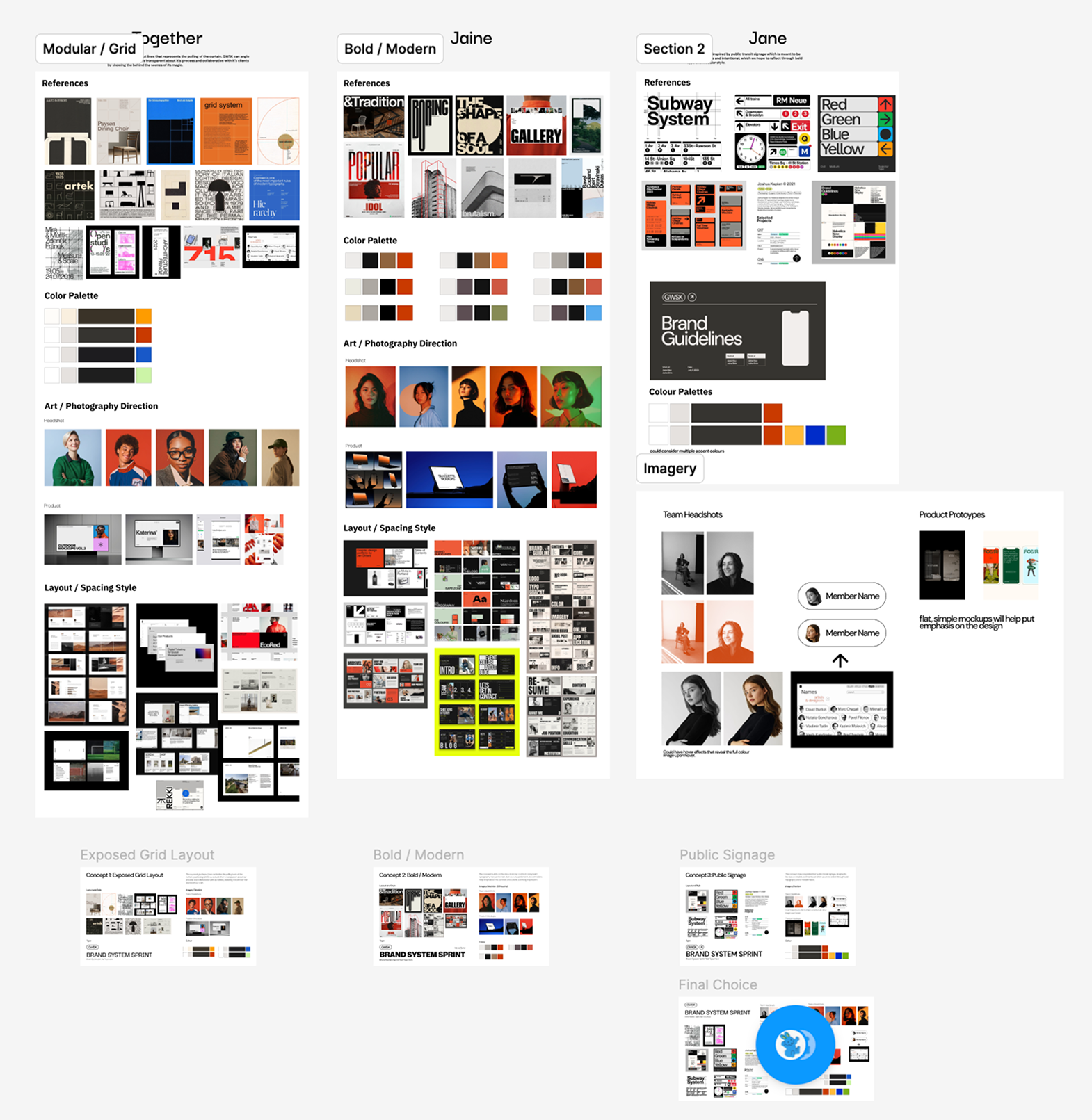
We started with moodboards from references like Pentagram, Teenage Engineering, and Bauhaus, looking for a language that felt systematic, but still human.
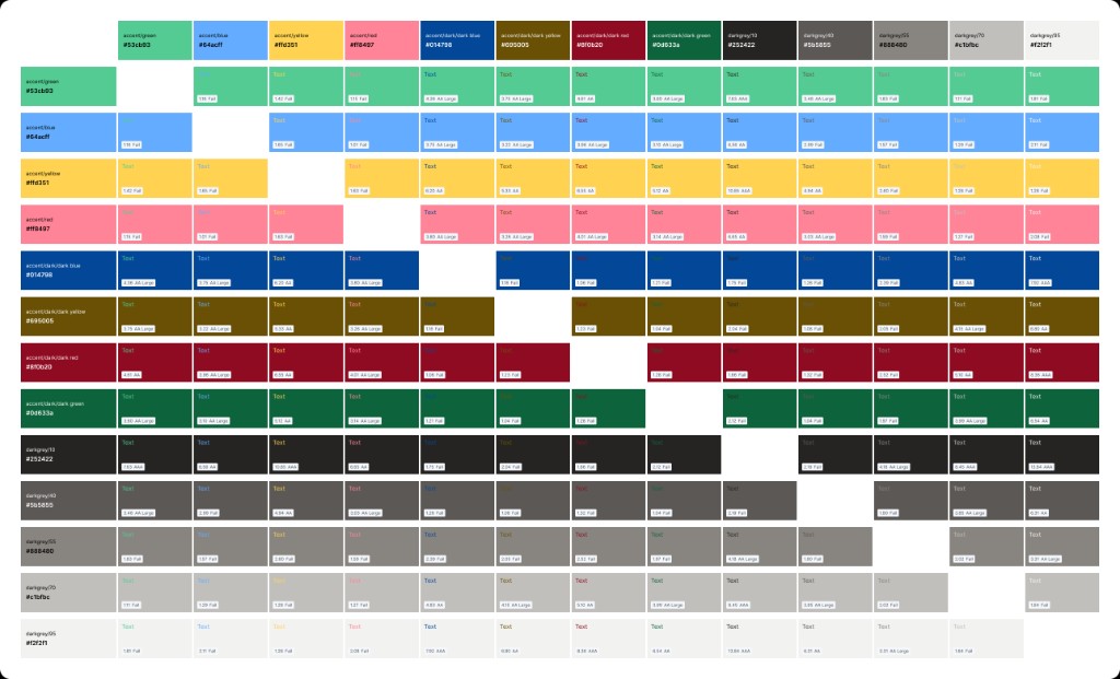
From there I tested colour combinations for accessibility, so each process-stage accent stayed readable across the system.
Reflection
Design process isn’t linear. Under a tight timeline we iterated between design and code, wearing both hats to see what was actually feasible.
Next: run usability testing on the live site, then measure booking conversion and whether the brand actually communicates how GWSK works.